02 / 2025 - 06 / 2025
Modern, simple, and accessible tarot app for beginners
tarotify - conceptual project*
👀 Problem
Most Polish-language tarot apps overwhelm beginners with complex rules, mystical jargon, cluttered designs, and poor accessibility - making them hard to use and unwelcoming to new users.
🎯 Solution
I designed a tarot app in Polish, with simple user flows and a clean, accessible interface that solves the core usability and accessibility issues.
💼 My tasks
✅ competitor analysis & benchmarking
✅ content models
✅ sitemap
✅ user flows
✅ information architecture
✅ low-fidelity wireframes
✅ basic design system
✅ accesibility basics
✅ high-fidelity wireframes
✅ copywriting
*The concept, content models, site map, and user flows were developed as part of a course Struktura 5 | Basic by Karolina Parysz - highly recommended.
1 / DEFINE
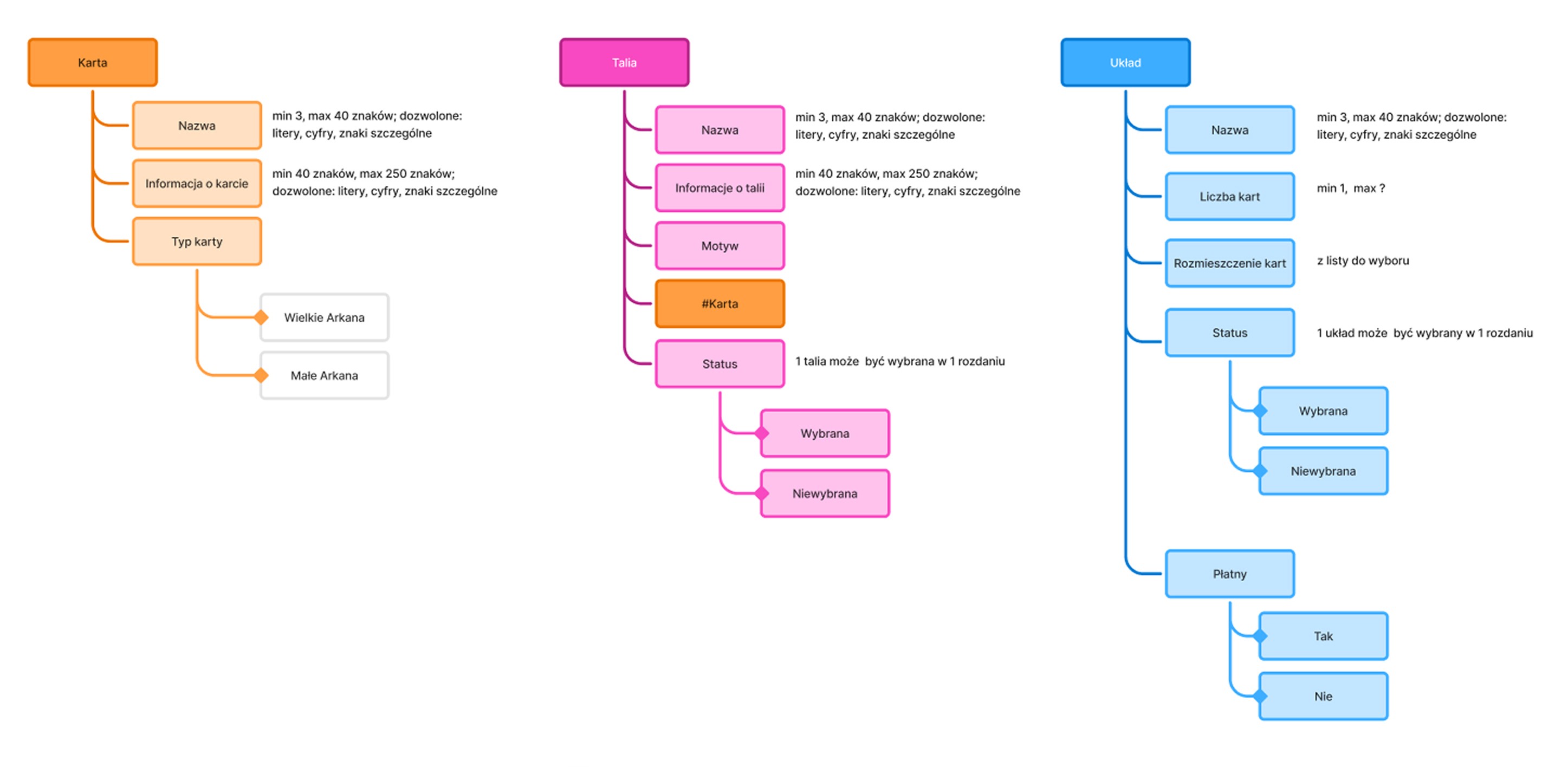
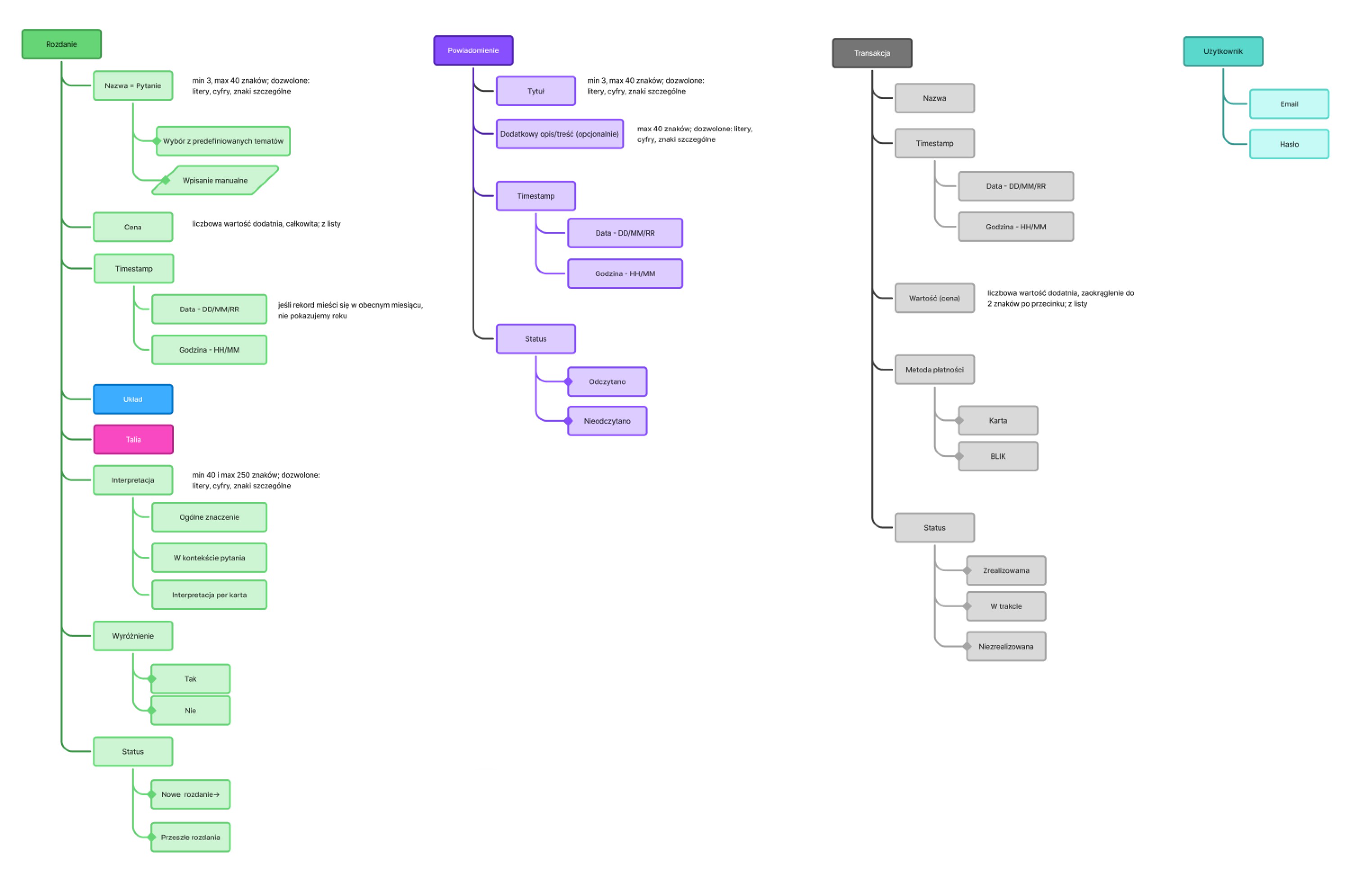
Content models
The starting point for the content models were materials prepared by the course instructor: a product brief and user story mapping.
Based on the story mapping, I broke down the app’s architecture into the smallest possible parts and used them to create content models.

1 / DEFINE
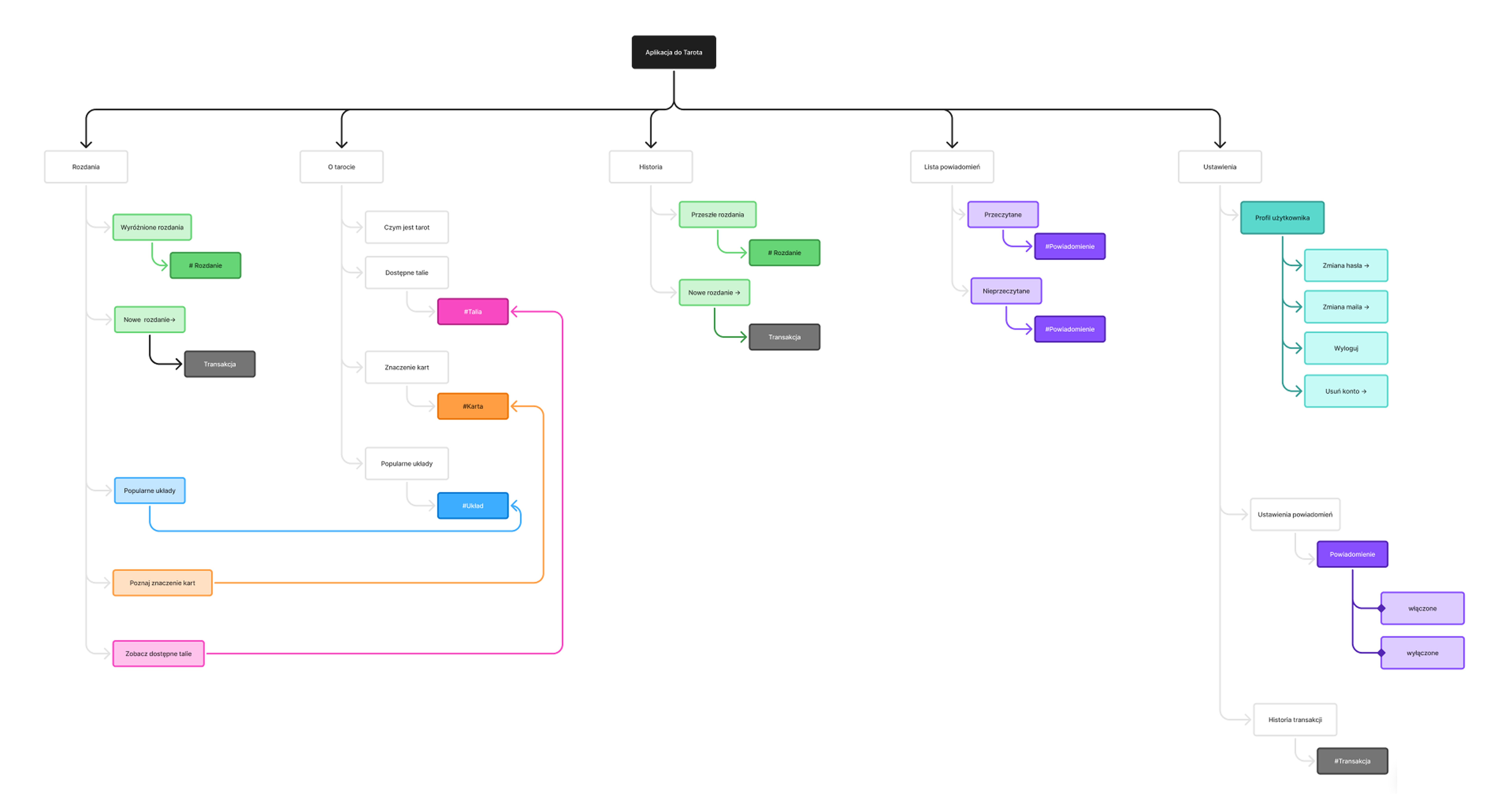
Sitemap
Next, I turned the content models into a simple, intuitive sitemap and marked focus points that need user flows.

1 / DEFINE
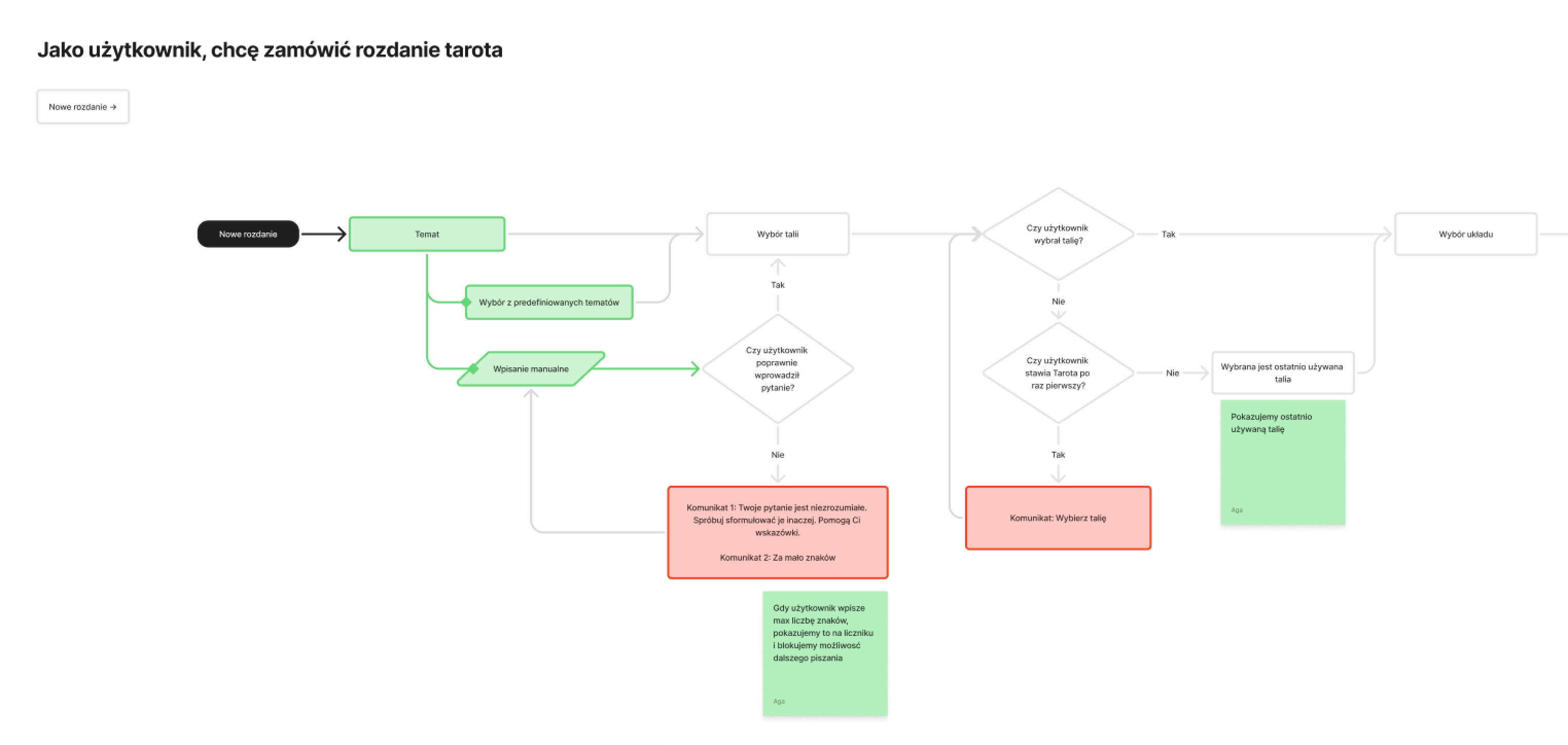
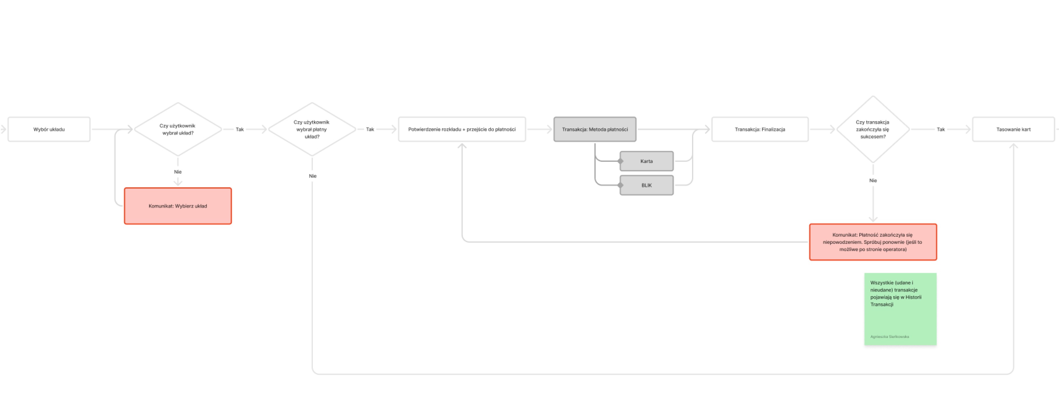
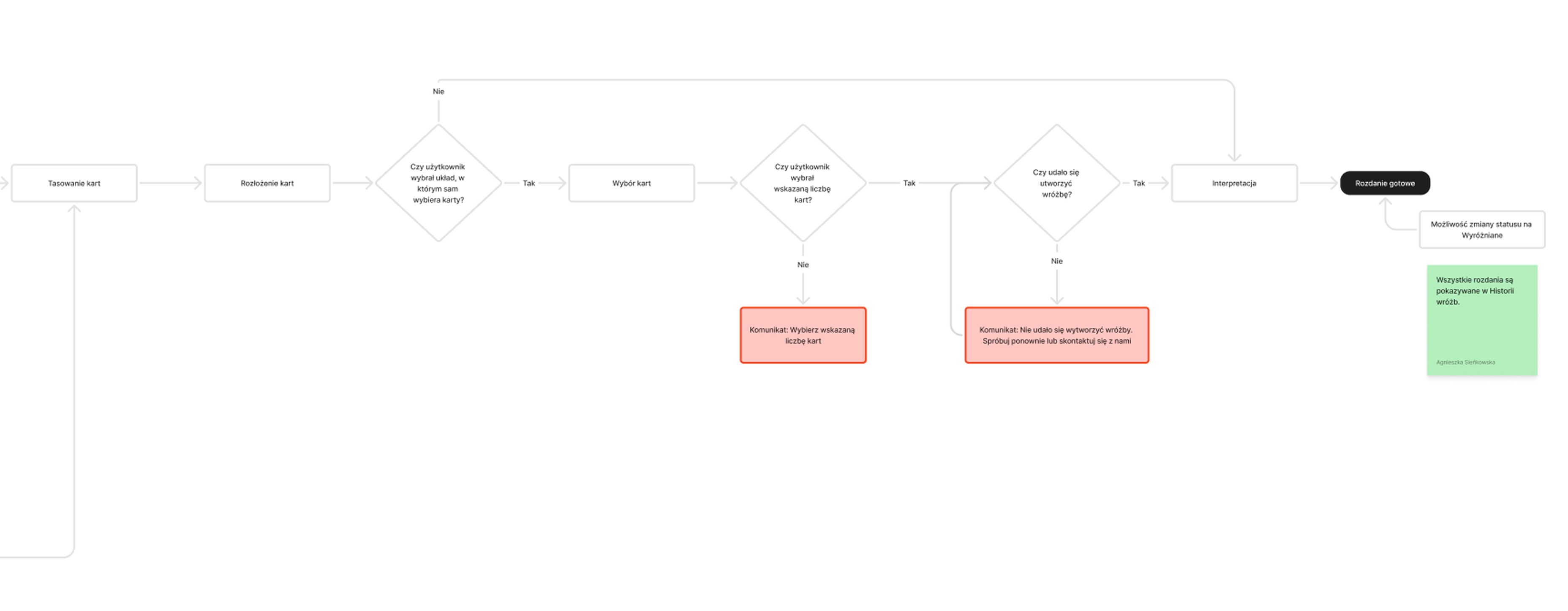
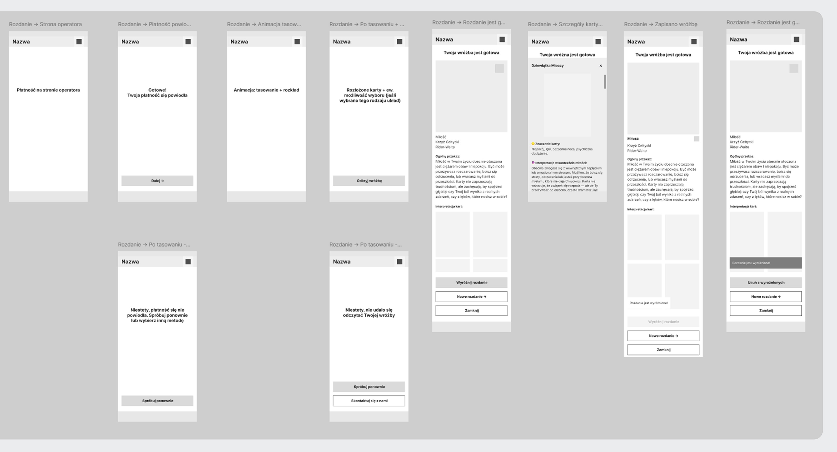
User flows
For each entry point, I added a user flow. I aimed to anticipate as many potential issues and corner cases as possible. Below is the main flow — the tarot reading process.
It was the final stage of the course.

2 / DISCOVER
Competitor analysis
& benchmarking
Due to the course structure, I completed the discovery phase after the define phase.
✅
Strengths
Creating atmosphere: color palette, card illustrations, symbolic elements
Creating the experience: simple steps and animations that feel like a real tarot reading
Personalization: choosing a deck, saving readings
❌
Pain points
Difficult-to-read content: unclear and unfriendly messages, small font sizes, low contrast between text and background, tight line spacing, decorative fonts
Overloaded screens filled with illustrations, decorative elements, notifications, and extension suggestions
High complexity and unclear user flows -especially challenging for beginners
Unattractive interface with poor visual hierarchy
💡
Insights
Simplicity - clear flows, simple language, and a clean visual style
Authenticity - feels like a real tarot reading with terminology, symbolism, animations, and atmosphere
Personalization - user can shape the reading and save the results
3 / DESIGN
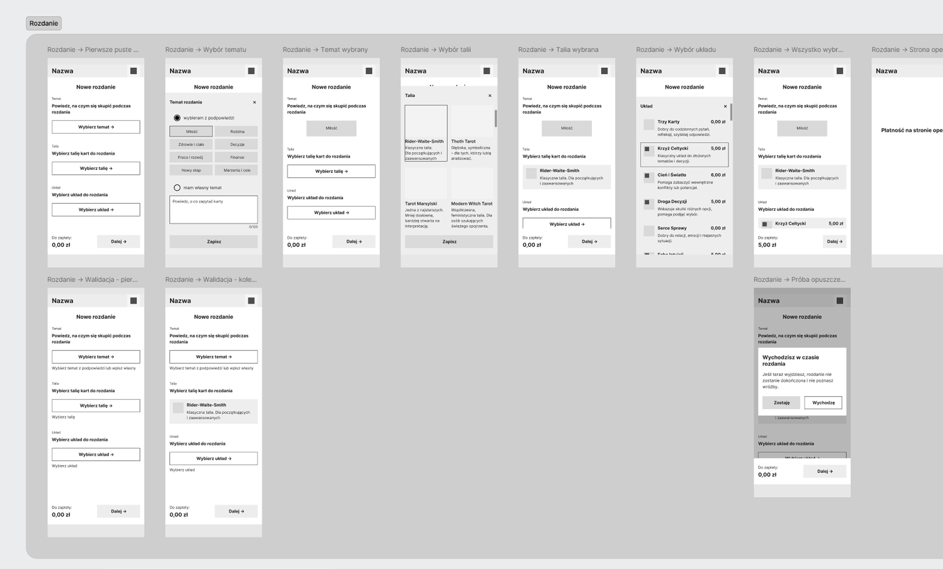
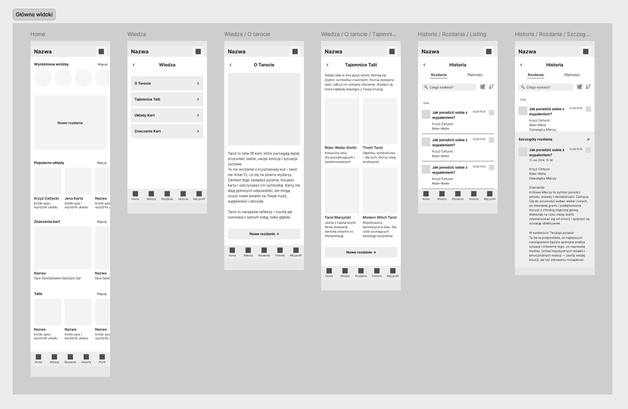
Low-fidelity wireframes
I created low-fidelity wireframes for the main flows, focusing on clear structure and real copy, written together with ChatGPT.
3 / DESIGN
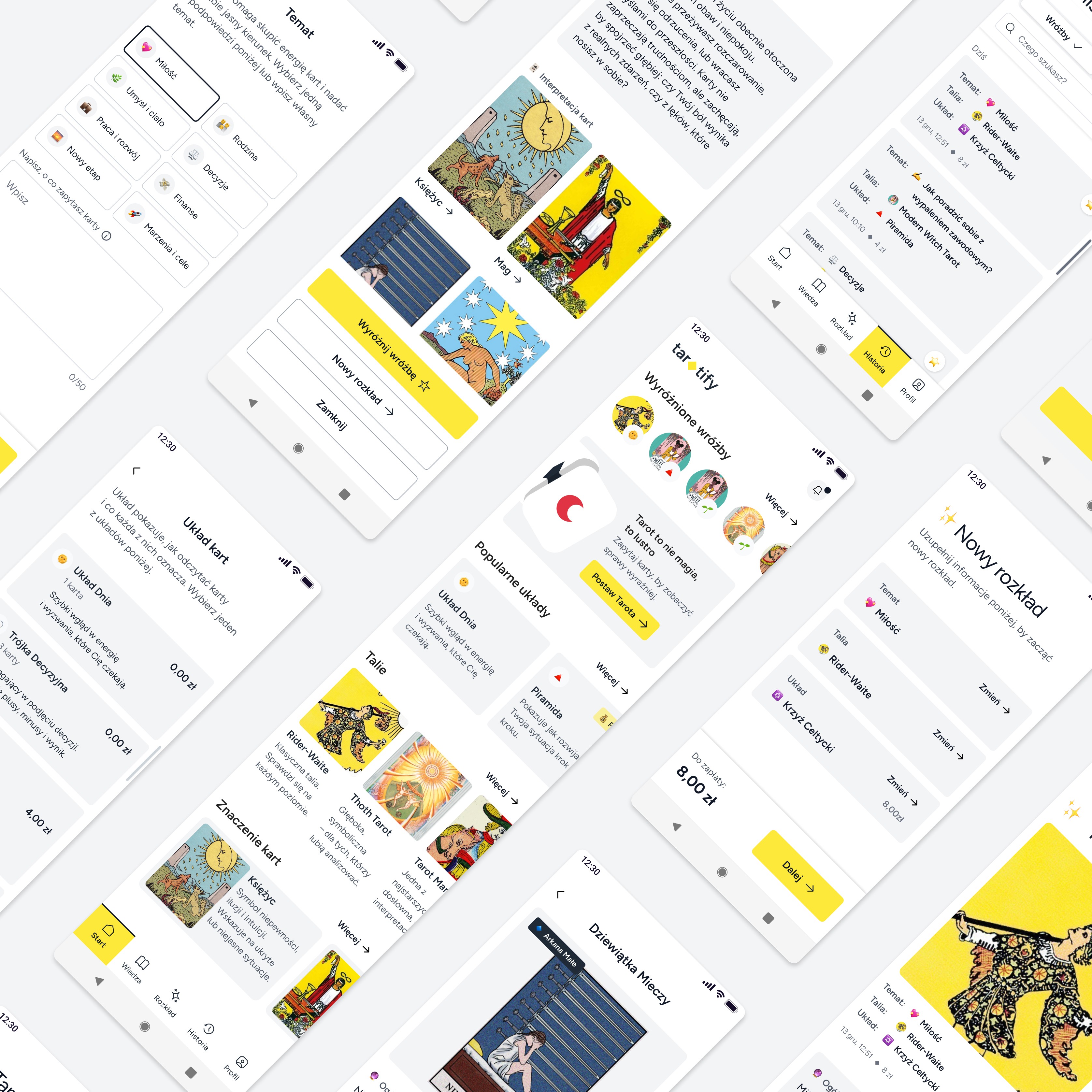
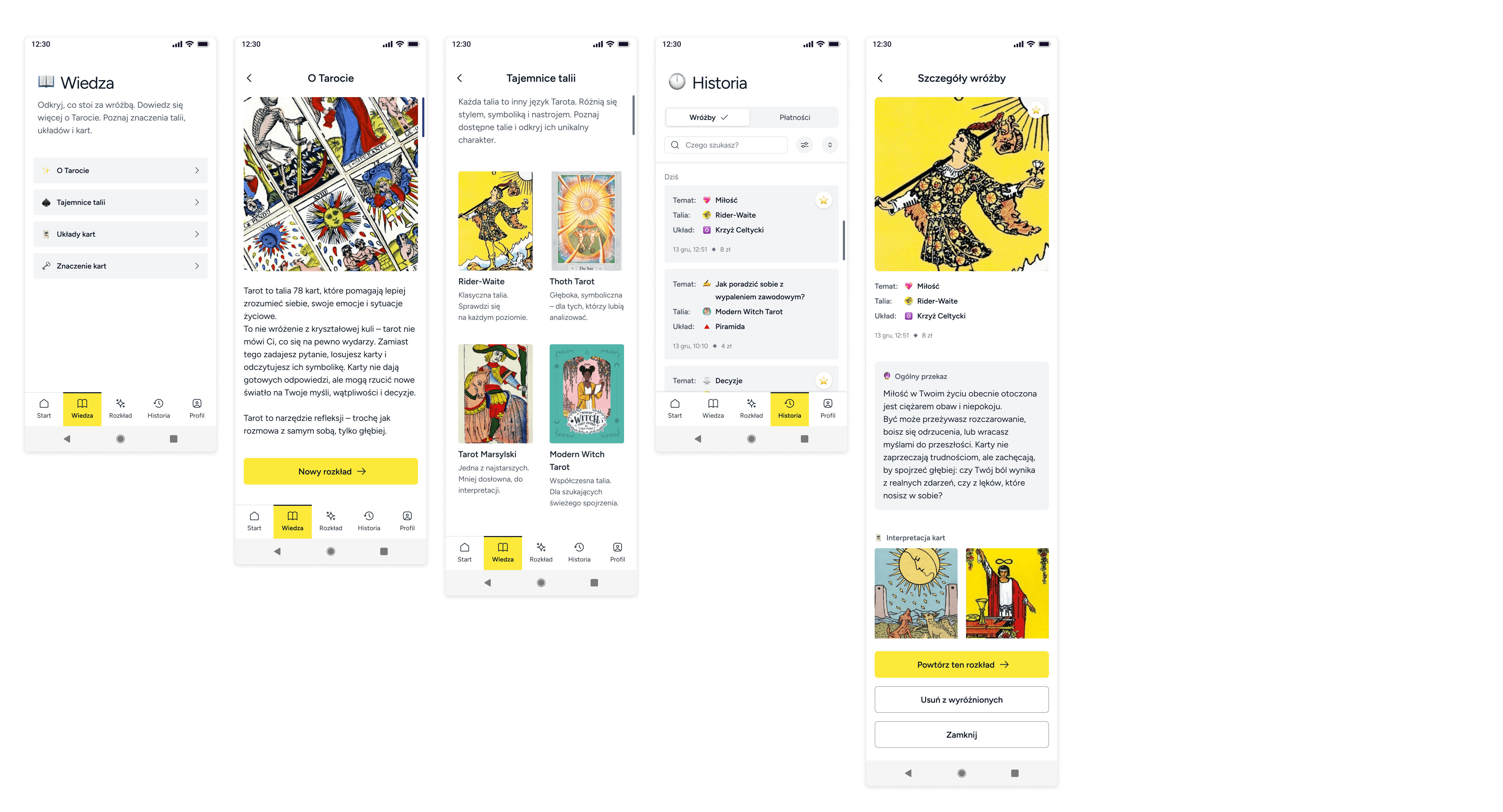
High-fidelity wireframes
While working with real content, I noticed things I could improve, like changing some texts to keep the tarot feel but still make them light and friendly, or turning bottom sheets into full screens because there was too much content.
I chose a light color palette to support clarity and ease of use for beginners.
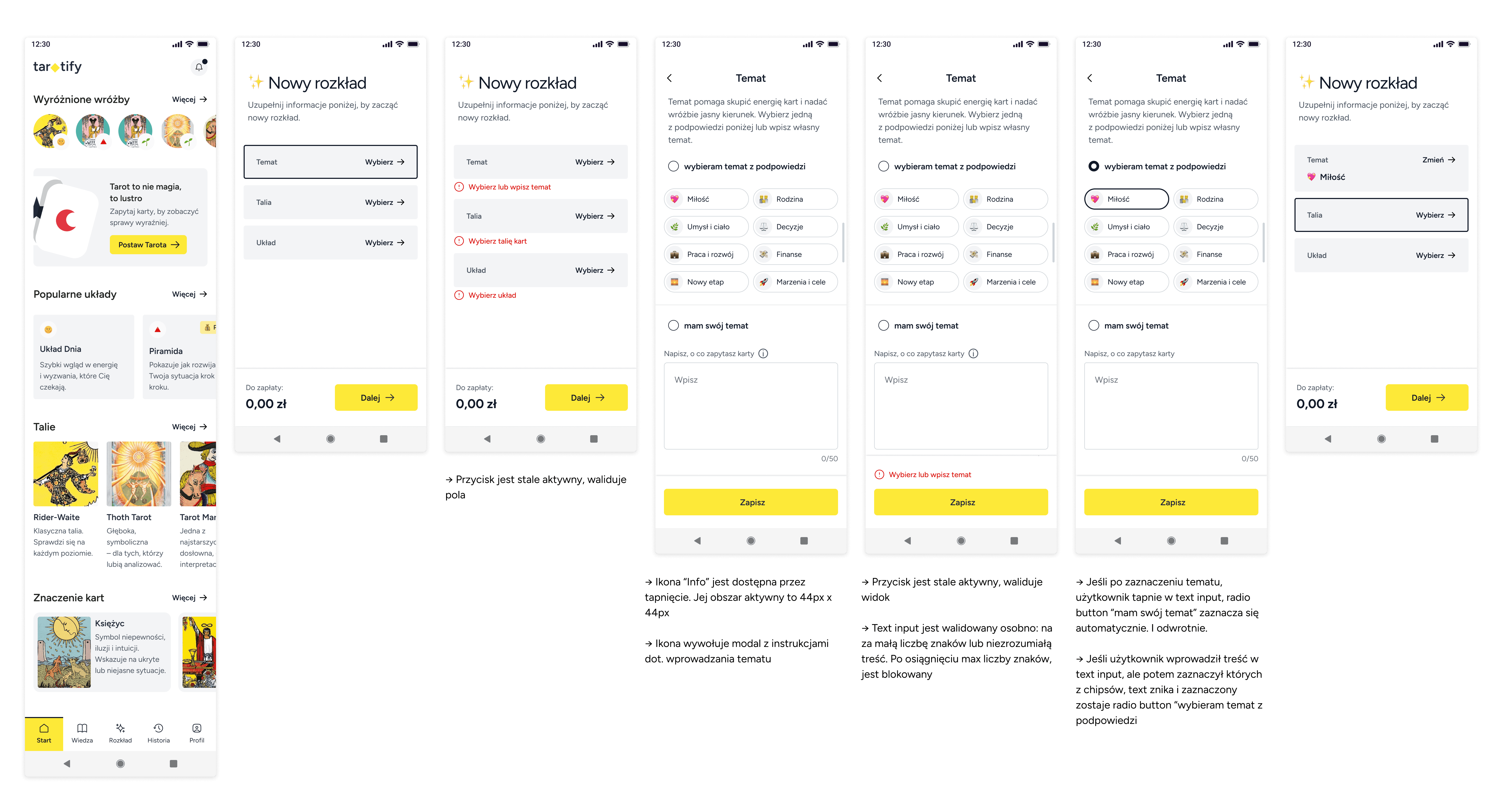
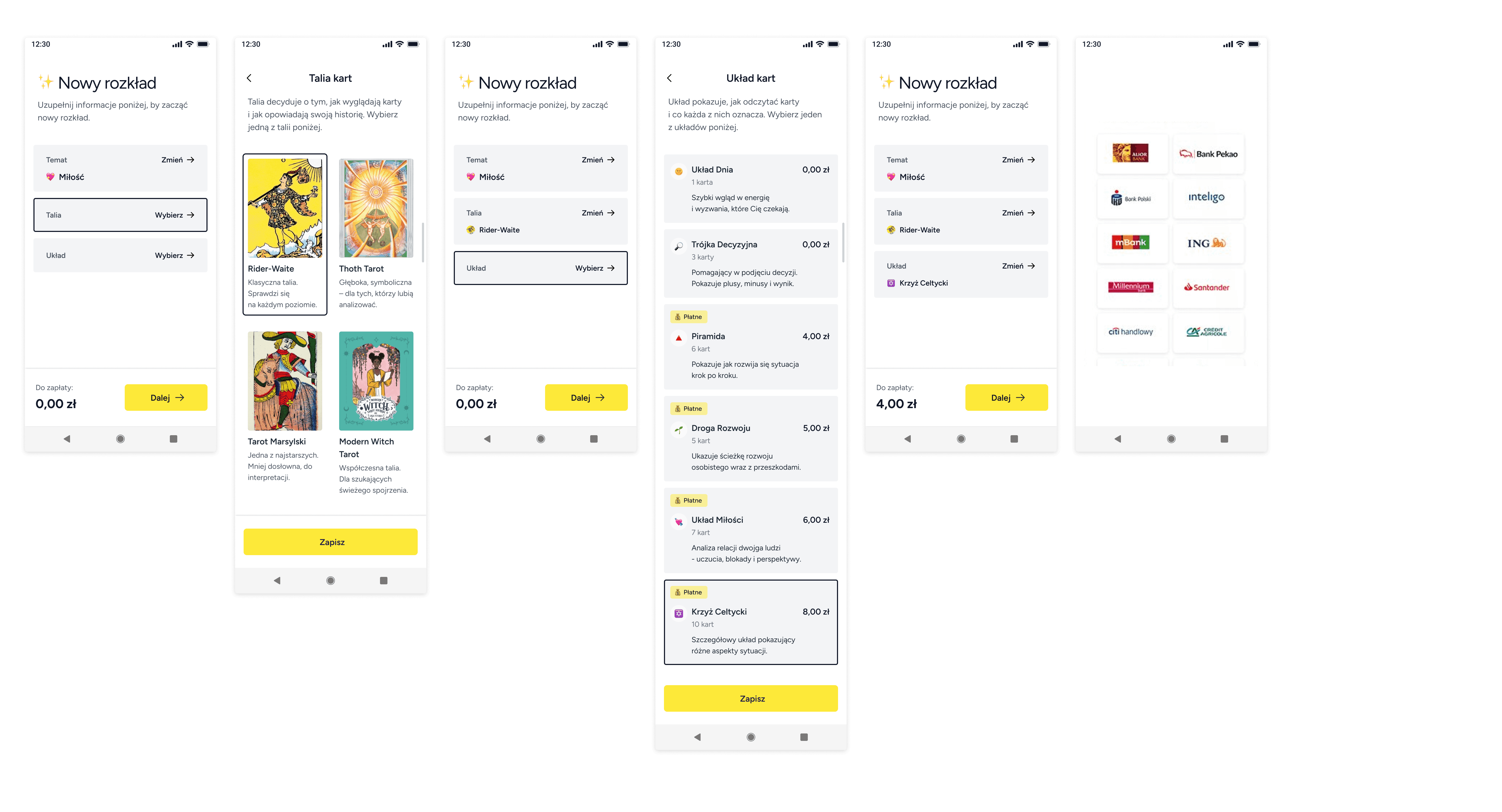
✨ New spread
1️⃣ To start a new tarot reading, the user needs to choose
a topic, a deck, and a spread.
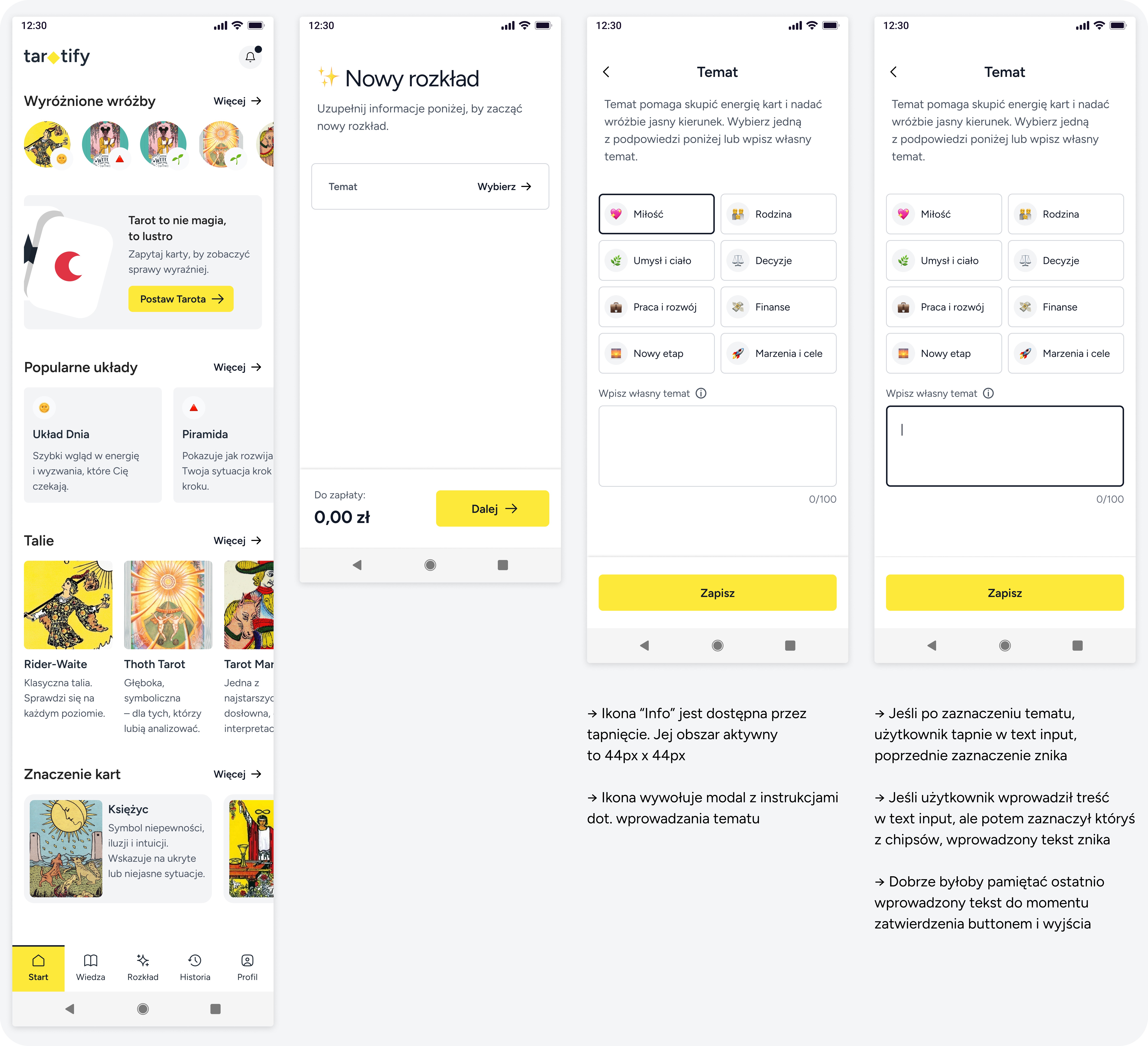
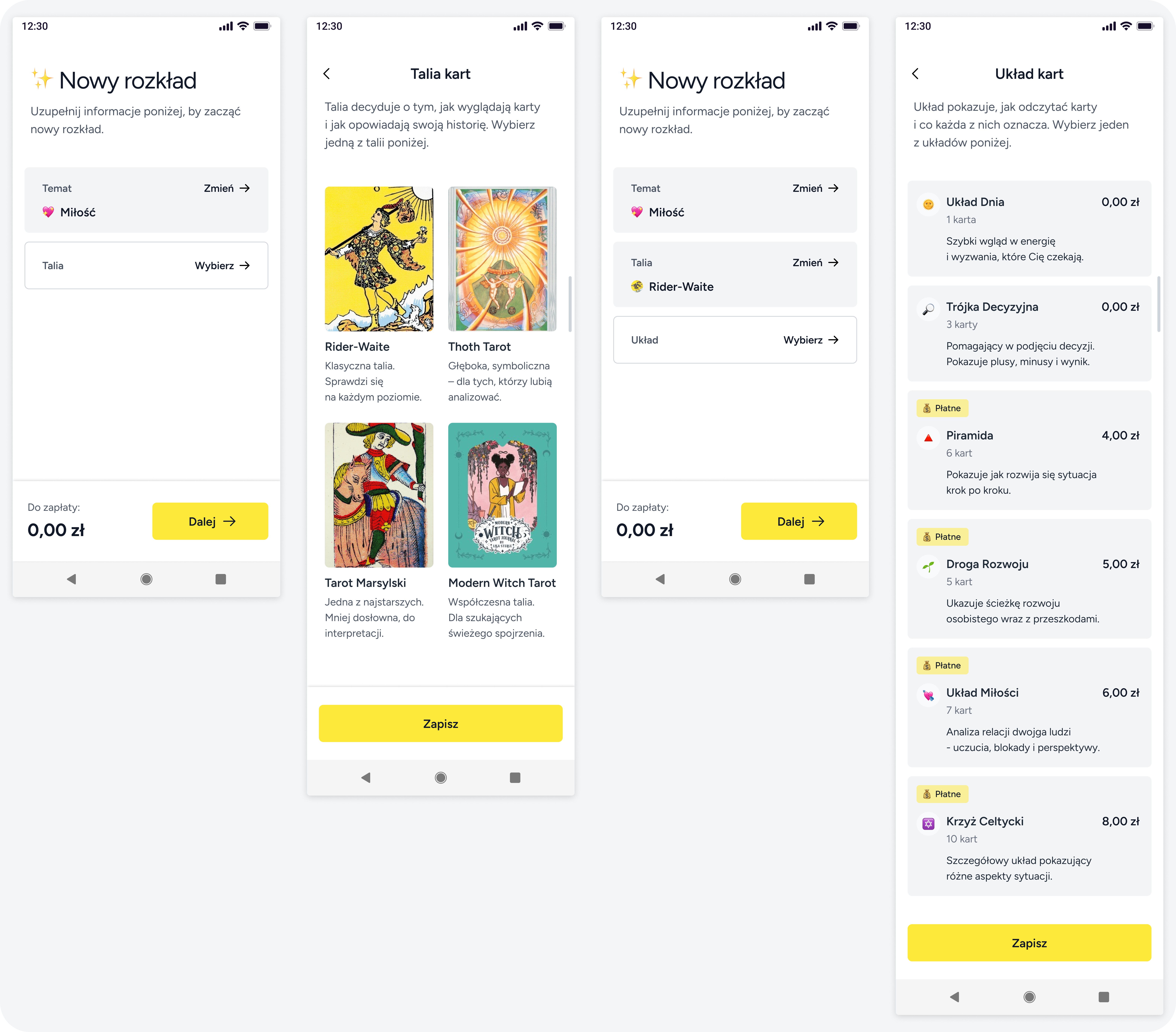
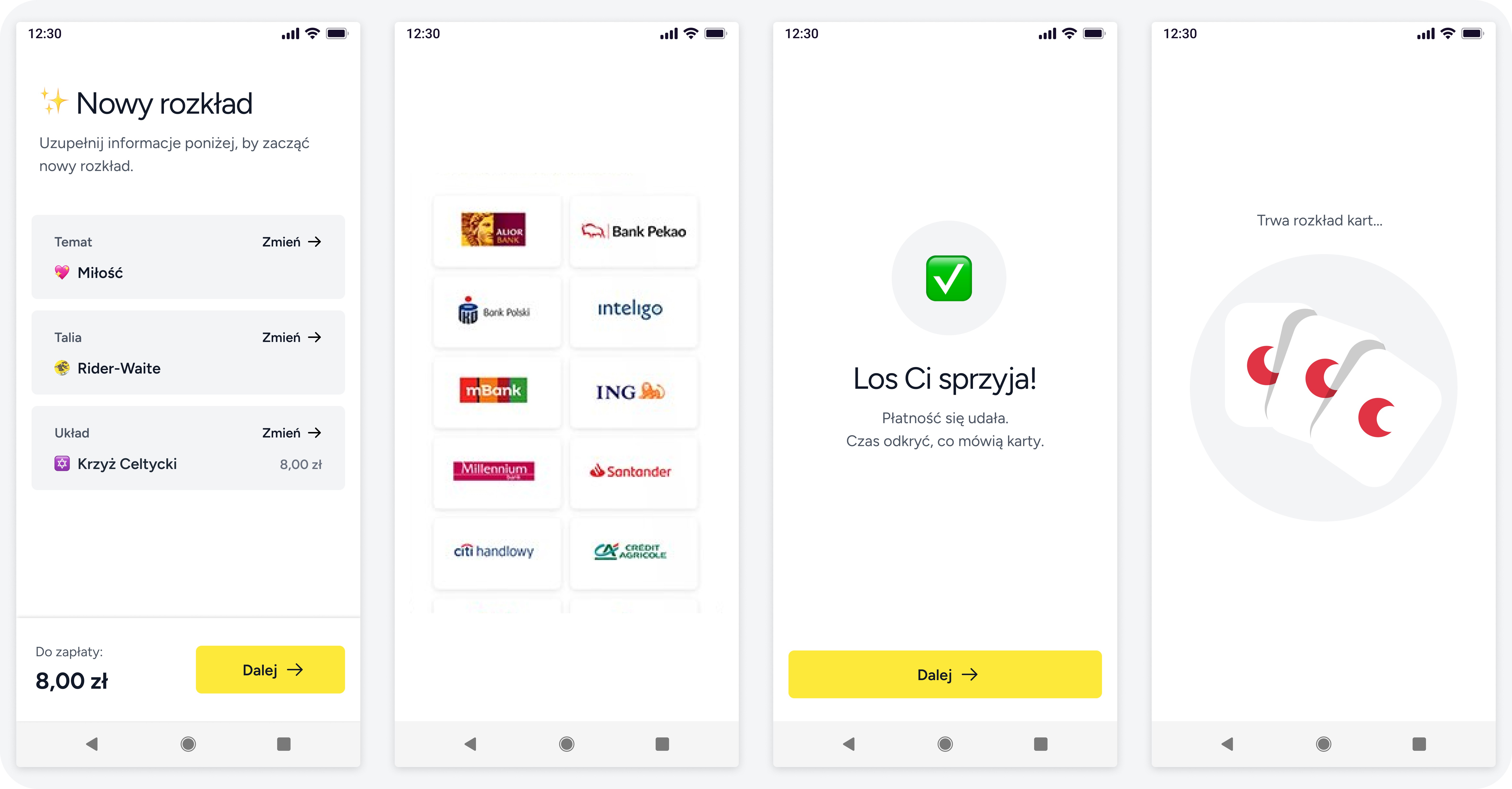
2️⃣ If the user picks a paid spread, they first see the payment screen, then the shuffling. If the spread is free, they go straight to the shuffling.
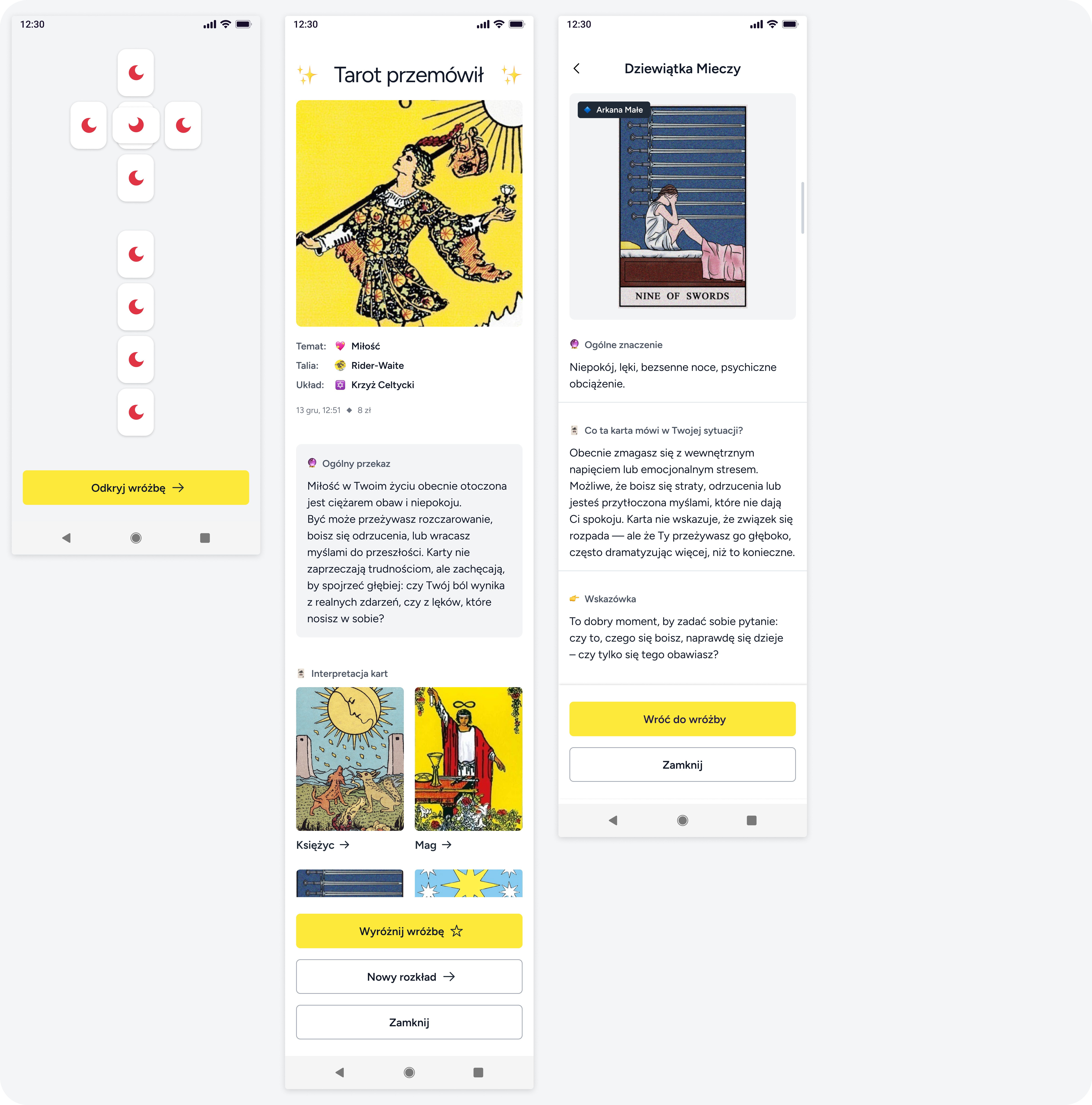
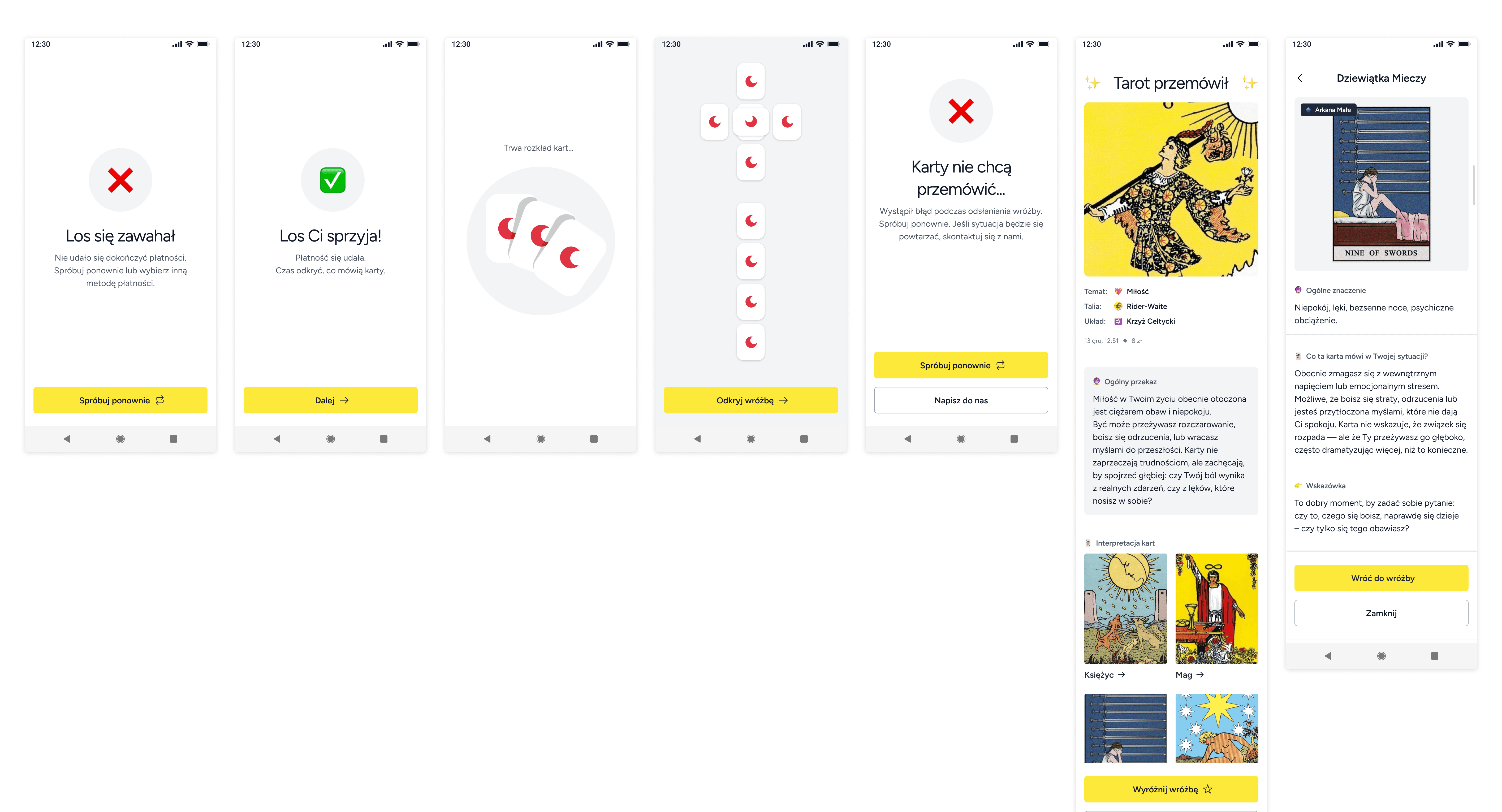
3️⃣ The user opens the reading. They can either read the overall message or explore each card’s meaning. If they chose a spread where they pick the cards themselves, that step happens first.
✨ New spread
1️⃣ To start a new tarot reading, the user needs to choose
a topic, a deck, and a spread.
2️⃣ If the user picks a paid spread, they first see the payment screen, then the shuffling. If the spread is free, they go straight to the shuffling.
3️⃣ The user opens the reading. They can either read the overall message or explore each card’s meaning. If they chose a spread where they pick the cards themselves, that step happens first.
✨ Other main screens
🛑 Validations and error messages
4 / DESIGN
Design System elements
In order to create the high-fidelity mockups, I defined the foundations of the design system: colors, typography, and core components.
I used the Tailwind UI library and followed WCAG (AA) guidelines.
Below, I present basic WCAG guidelines I followed and the components in the variants necessary to build the interface.
🚀 Basic WCAG AA Accessibility Guidelines I Followed
PERCEIVALBE
✅
Each card has a clear and specific purpose.
-> Users knows what they can do.
✅
The app doesn’t rely on color only – important elements also use text and icons. For example, form errors are shown with color, a message, and an icon.
-> Users with color vision difficulties can use the app.
✅
Text-to-background contrast ratio above 4.5:1
-> Users can read the content effortlessly.
✅
Main text above 16px, line height 1.5, simple and legible font.
-> Users can read the text more easily and might understand the content better.
✅
Interactive elements have a minimum active area of 44x44 px
-> Users notice the element and can easily tap it while using mobile devices.
✅
No flashy elements
-> Users who are neurodivergent or sensitive to flashing lights can use the interface safely without risk of seizures or sensory overload.
OPERABLE
✅
Each element has focus state.
-> Users with assistive technologies can see the focus state, making it easier to navigate and interact with the app.
UNDERSTANDABLE
✅
Plain language
-> Users can quickly understand the content, making interaction easier and faster, especially for people with different reading levels and cognitive abilities.
✅
Permanent Visible Labels
-> Users can easily understand the purpose of each input or interactive element without confusion. They don't have to remember or guess.
✅
No placeholders in inputs
-> They can be confusing because they disappear when clicked, may have low contrast, can look like prefilled values, and are hard for assistive technologies to understand.
🧩 Basic componnets
02 / 2025 - 06 / 2025
Modern, simple, and accessible tarot app for beginners
tarotify - conceptual project*
👀 Problem
Most Polish-language tarot apps overwhelm beginners with complex rules, mystical jargon, cluttered designs, and poor accessibility - making them hard to use and unwelcoming to new users.
🎯 Solution
I designed a tarot app in Polish, with simple user flows and a clean, accessible interface that solves the core usability and accessibility issues.
💼 My tasks
✅ competitor analysis & benchmarking
✅ content models
✅ sitemap
✅ user flows
✅ information architecture
✅ low-fidelity wireframes
✅ basic design system
✅ accesibility basics
✅ high-fidelity wireframes
✅ copywriting
*The concept, content models, site map, and user flows were developed as part of a course Struktura 5 | Basic by Karolina Parysz - highly recommended.
1 / DEFINE
Content models
The starting point for the content models were materials prepared by the course instructor: a product brief and user story mapping.
Based on the story mapping, I broke down the app’s architecture into the smallest possible parts and used them to create content models.
1 / DEFINE
Sitemap
Next, I turned the content models into a simple, intuitive sitemap and marked focus points that need user flows.
1 / DEFINE
User flows
For each entry point, I added a user flow. I aimed to anticipate as many potential issues and corner cases as possible. Below is the main flow — the tarot reading process.
It was the final stage of the course.
2 / DISCOVER
Competitor analysis
& benchmarking
Due to the course structure, I completed the discovery phase after the define phase.
✅
Strengths
Creating atmosphere: color palette, card illustrations, symbolic elements
Creating the experience: simple steps and animations that feel like a real tarot reading
Personalization: choosing a deck, saving readings
❌
Pain points
Difficult-to-read content: unclear and unfriendly messages, small font sizes, low contrast between text and background, tight line spacing, decorative fonts
Overloaded screens filled with illustrations, decorative elements, notifications, and extension suggestions
High complexity and unclear user flows -especially challenging for beginners
Unattractive interface with poor visual hierarchy
💡
Insights
Simplicity - clear flows, simple language, and a clean visual style
Authenticity - feels like a real tarot reading with terminology, symbolism, animations, and atmosphere
Personalization - user can shape the reading and save the results
3 / DEVELOP
Low-fidelity wireframes
I created low-fidelity wireframes for the main flows, focusing on clear structure and real copy, written together with ChatGPT.
4 / DESIGN
Design System elements
In order to create the high-fidelity mockups, I defined the foundations of the design system: colors, typography, and core components.
I used the Tailwind UI library and followed WCAG (AA) guidelines.
Below, I present basic WCAG guidelines I followed and the components in the variants necessary to build the interface.
3 / DEVELOP
High-fidelity wireframes
I used the Tailwind UI library and followed AA accessibility guidelines.
While working with real content, I noticed things I could improve, like changing some texts to keep the tarot feel but still make them light and friendly, or turning bottom sheets into full screens because there was too much content.
I chose a light color palette to support clarity and ease of use for beginners.
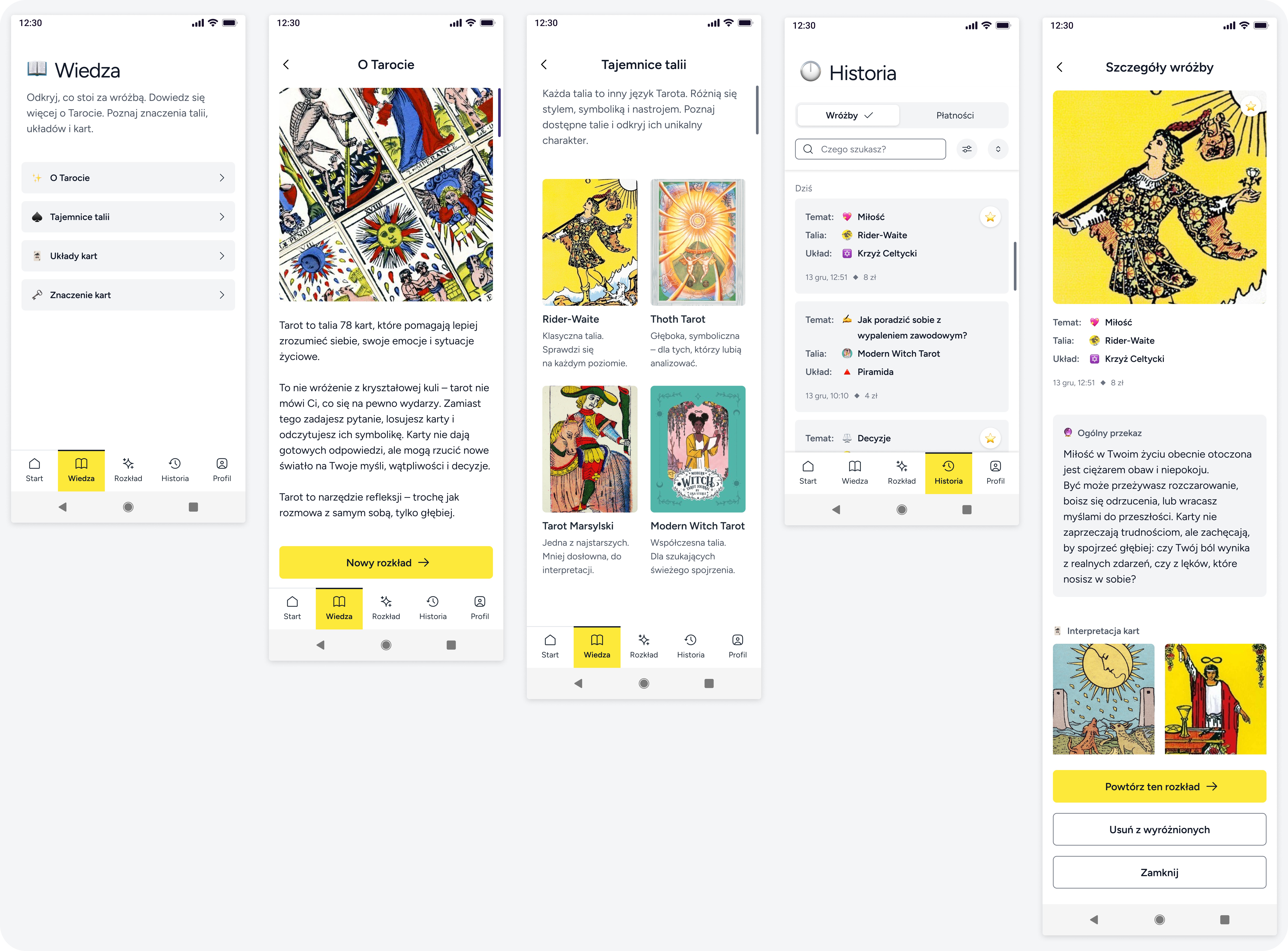
✨ Other main screens
🚀 Basic WCAG AA Accessibility Guidelines I Followed
PERCEIVALBE
PERCEIVALBE
✅
Each card has a clear and specific purpose.
-> Users knows what they can do.
✅
The app doesn’t rely on color only – important elements also use text and icons. For example, form errors are shown with color, a message, and an icon.
-> Users with color vision difficulties can use the app.
✅
Text-to-background contrast ratio above 4.5:1
-> Users can read the content effortlessly.
✅
Main text above 16px, line height 1.5, simple and legible font.
-> Users can read the text more easily and might understand the content better.
✅
Interactive elements have a minimum active area of 44x44 px
-> Users notice the element and can easily tap it while using mobile devices.
✅
No flashy elements
-> Users who are neurodivergent or sensitive to flashing lights can use the interface safely without risk of seizures or sensory overload.
OPERABLE
OPERABLE
✅
Each element has focus state.
-> Users with assistive technologies can see the focus state, making it easier to navigate and interact with the app.
UNDERSTANDABLE
UNDERSTANDABLE
✅
Plain language
-> Users can quickly understand the content, making interaction easier and faster, especially for people with different reading levels and cognitive abilities.
✅
Permanent Visible Labels
-> Users can easily understand the purpose of each input or interactive element without confusion. They don't have to remember or guess.
✅
No placeholders in inputs
-> They can be confusing because they disappear when clicked, may have low contrast, can look like prefilled values, and are hard for assistive technologies to understand.
🧩 Basic componnets